CASE STUDY
Spotlight: Making a Map
Client
Contraceptive Access Initiative
Services
Branding
Creative Campaign & Art Direction
Visual Identity
Film and Video Production
Print, Editorial and Visual Design
Data Visualization
______
instagram
@caminocreative
contact
info@caminopr.com
(212) 255-2575
Challenge
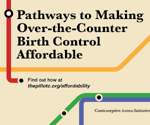
How can we clearly illustrate the actionable paths to achieving truly affordable, over-the-counter access to contraception for policymakers and influential decision-makers in Washington, D.C.? The Contraceptive Access Initiative, a nonprofit advancing over-the-counter birth control access, posed this question to Camino Creative's design team. In a single image, we needed to show the convergence of all pathways to affordable access for the Pill OTC.
Solution
Based on the original op-ed that started the campaign, titled “A roadmap for making over-the-counter birth control affordable,” Camino Creative started sketching out various roadmaps. After some discussion this idea evolved from a highway into public transportation. The resulting map was a blend of color, line thickness, station icons, and text treatment informed by transit diagrams from around the world.
Results
The final version of our award-winning map has appeared in print ads (POLITICO, The Hill), a digital ad campaign, a report cover, and on CAI’s website. It also inspired an explainer video, narrated by one of CAI’s cofounders. We’re proud to have designed an actionable graphic that furthers CAI’s mission: contraceptive access for all!
Making a Map
To make this map, we needed to establish which points we were connecting, and where they were going. Dana Singiser’s op-ed, identified four pillars of affordability: coverage from public insurance, coverage from private insurance, a low price point and access for the uninsured. These four pathways needed to channel into one destination, which made highway signage as well as traditional transit maps an issue. Highway signs start in one place of origin, which is where the driver is reading the sign from, and branch off into further destinations. By contrast mass transit diagrams, even in systems that funnel into a specific area (like the Long Island Railroad at Penn Station), imply traffic in both directions.
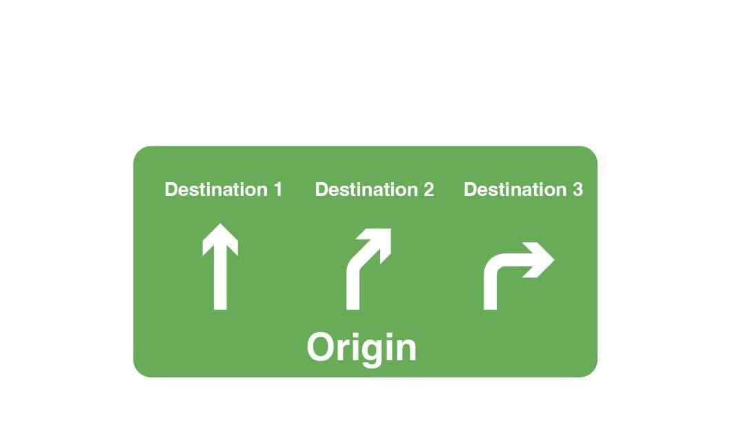
Highway Signs
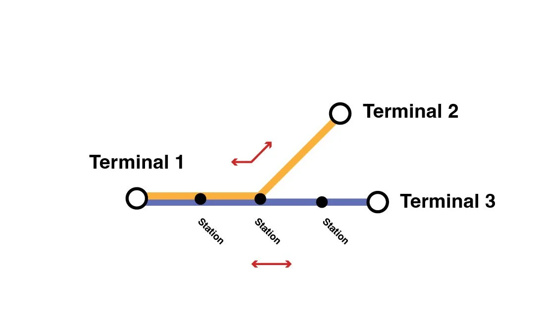
Subways
The first iteration of the map saw a departure from CAI’s main brand colors as a one-off project. In order to flesh out a larger campaign, the color scheme was updated to a “Primaries + Green” arrangement so that each one would be highly distinct from the others.
Social Media Graphic
Inspiration


Building a sub-brand
Dana Singieser’s op-ed was the start, and the RFI Ad was a big step forward into the limelight, but the fight for affordable over-the-counter contraception is a long one, and one that requires more than just an article or newspaper ad. To ensure that the work we were doing set up CAI to continue to fight for this cause, we chose select elements of our design research to become the outlines of a sub-brand for CAI and all of their Affordability campaign-related materials.
Color
For the first iteration of this project, which was posted to social media, we drew inspiration from a custom map printed to guide travelers to the World’s Fair in 1939. We liked this design for its bold colors as well as clear direction of traffic into one area from across the entire city. For the continued campaign we needed to reimagine the map into a version that was more tailored to the region of focus for this campaign’s core audiences: Washington, D.C.

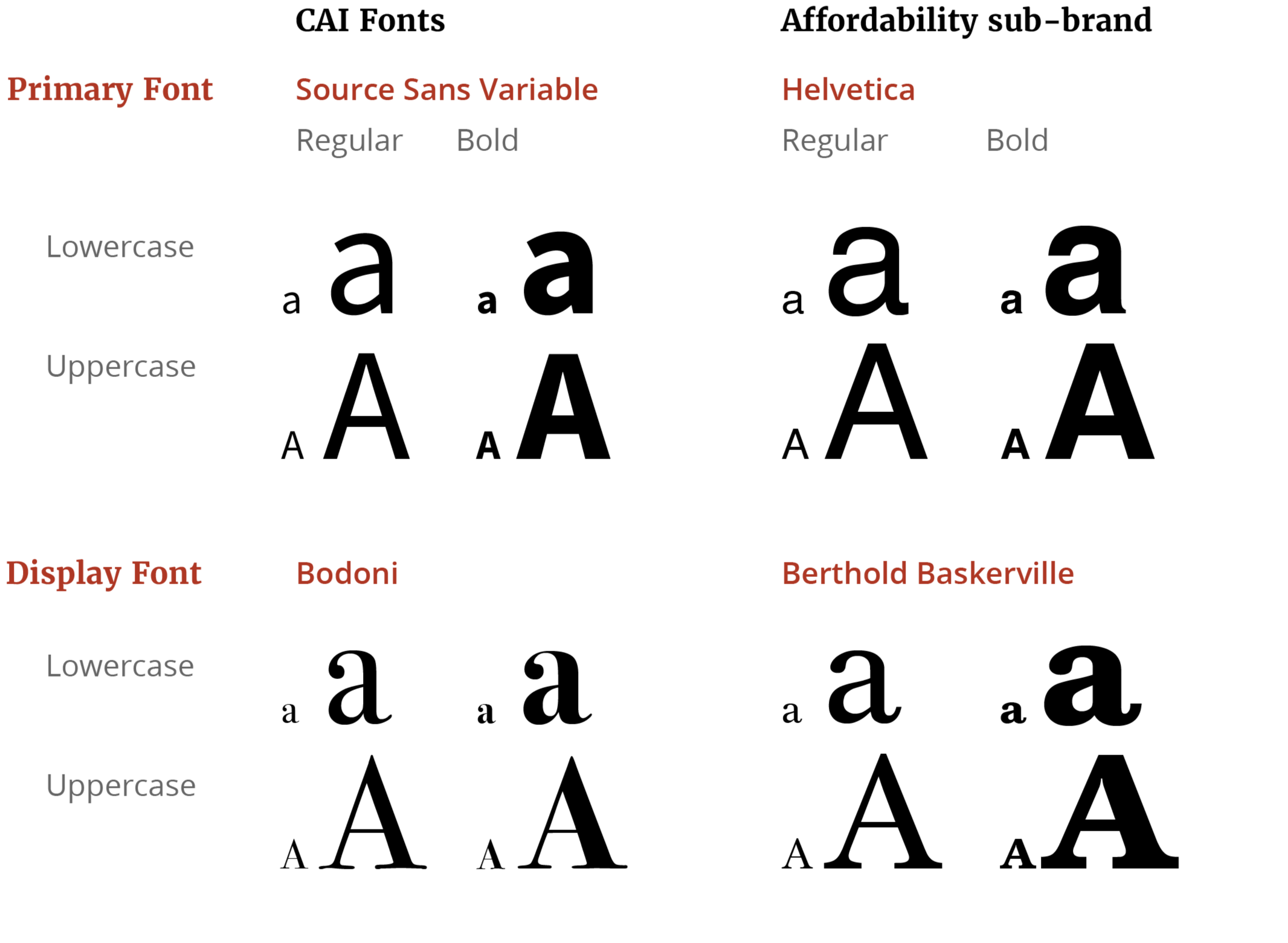
To stay close to recognizable public transit branding, we changed our arrange of fonts from CAI’s typical typefaces to ones that more closely matched what you see on a subway. This made Helvetica an obvious choice as the primary font, and Berthold Baskerville gave a nice compliment for headers and display cases.
Type
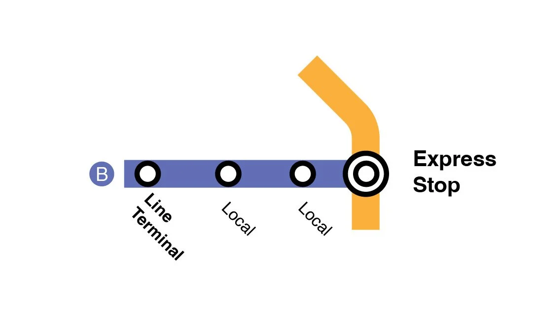
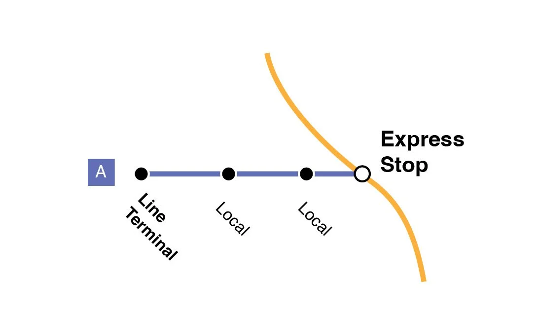
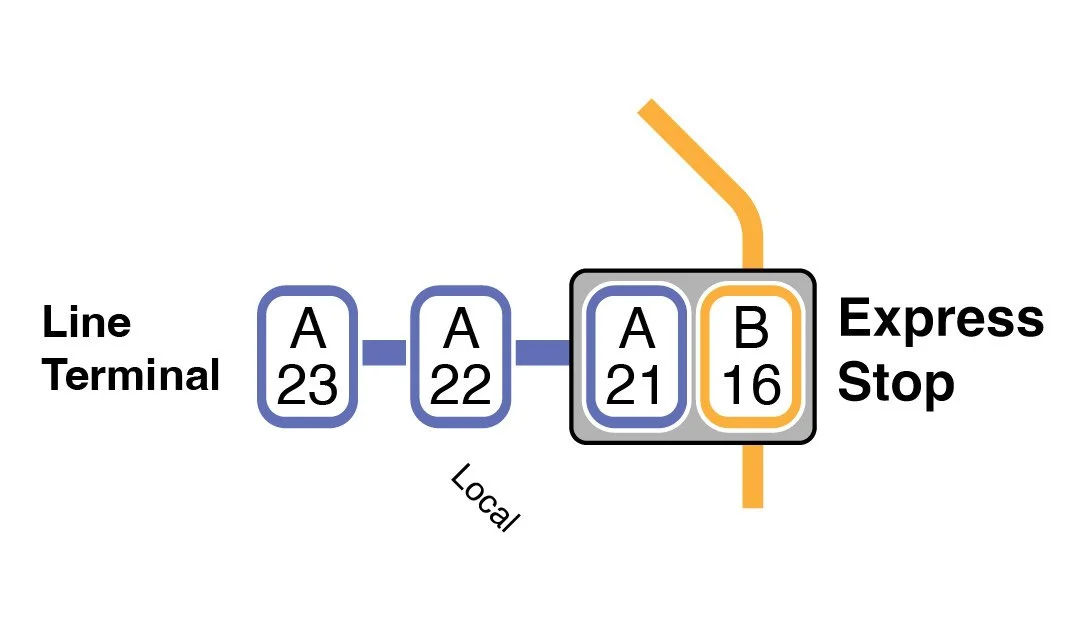
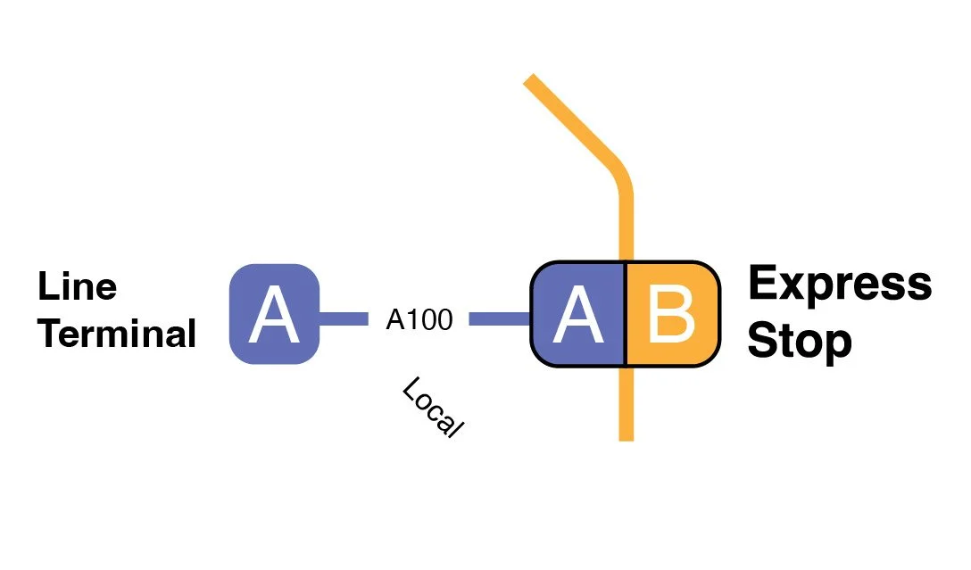
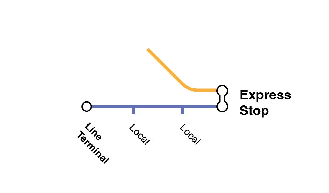
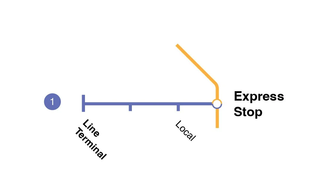
The “stops” on our subway lines had an important purpose, since the ends of each lines needed to feel bolder and more prominant than the stops in between. Most transit maps have a distinction between local stops and express or transfer stops, and our search for the right graphic solution to took us around the globe, looking at how mass transit systems organized the relevant categories of information.
Stops along the way
Washington, D.C.
New York City
Tokyo
Seoul
London
Moscow
After scouring the globe for graphic solutions, we decided to re-focus our search locally. The Virginia Department of Rail and Public Transportation (DRPT) offers a map of local Amtrak service going through the state, converging on Alexandria and offering a continuation to the rest of the Northeast: D.C., Maryland, Delaware, Pennsylvania, New Jersey, New York, etc. Many lines continue to the South and West of Virginia, each with their own gray arrow and labeled with the further states (Florida, South Carolina, West Virginia, etc.). The treatment of significant stations involves moving the name to within the station’s bounding box, and use a white dot and black outline for stations serviced by only one line.
Virginia Department of Rail and Publc Transportation
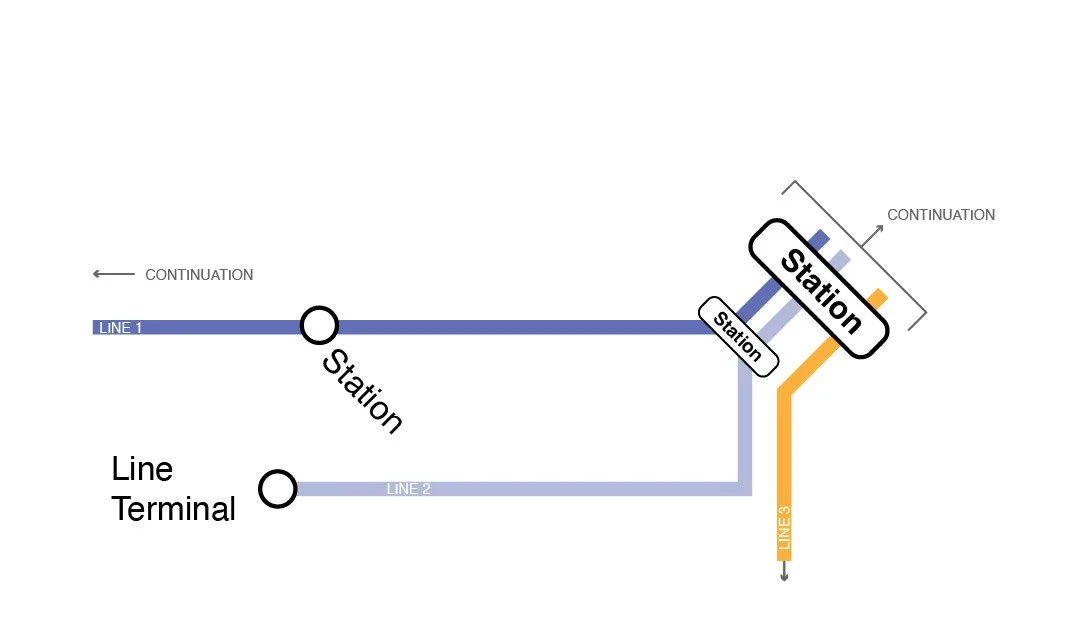
We ultimately settled on an amalgamation of maps. Since we wanted this to be recognizable to D.C. residents, we started with the Metro’s signature thick lines, curved edges and train line colors for easy recognition and legibility. For the stations, we used D.C.’s white dots with thick black outlines as the line terminals and used NYC’s less conspicuous black dots with a beige outline for separation from the line color. For our most important station, Affordability, we followed the example set forth in Tokyo and Virginia by putting the relevant text inside the bounding box. Finally we used the DRPT map’s continuations to indicate the direction of traffic away from the dead-end terminals and towards a common goal.
Building a sub-brand
We had our colors and font selection in place, which means that in order to complete the sub-brand we need to tie a bow on it with a nice logo.

RFI Ad
The first stage of this campaign rollout was a series of print and web advertisements placed in Politico and The Hill during the run-up to the RFI hearing. This featured two full-page ads, one in each publication, as well as a web takeover of the Hill.

Web

The Report
To preserve cohesion between the ad campaign and accompanying report, we leaned into the familiar aesthetics of public transit materials: bold Helvetica and Baskerville, a primary color scheme with added green and the use of train imagery. This approach also underscored the fact that this is a public-facing campaign.
Front Cover
Back Cover
Inside Pages
Videos
The final component of this campaign was a video companion, which put CAI’s medical expertise at the forefront. CAI co-founder Dana Singiser narrates while illustrations of each “line” demonstrate how that particular pathway leads to affordable access. To accomplish this project we coordinated between CAI and a third–party vendor, overseeing coordination between all parties involved in the project while also maintaining brand consistency to match the rest of the campaign.
About CAI
The nonprofit Contraceptive Access Initiative (CAI) works to increase access to contraception for all: free from stigma, bias or coercion. CAI supports affordable over-the-counter access to oral contraception without restrictions. Our work reduces misinformation and challenges disinformation, while uplifting educational content that helps people make the choices that are right for them.
Visit CAI


About Camino Creative
Our team supports Camino PR’s broad range of clients, all of whom are committed to making the world a better place. This includes organizations and individuals working on expanding reproductive health care, protecting LGBTQIA+ rights, strengthening workers’ rights and advancing climate solutions. We believe in and practice Camino PR’s guiding motto: It’s About People.